
UI Rework Case Study

Role
Product designer in team of product managers and engineers
Timeline
Multiple projects spanning between 2021-2024
Overview
During my time at Aimlabs , I focused on enhancing the visual design and user experience of our segmented aim trainer, making our systems more efficient, modular, and user-friendly for our players and internal development teams.
This effort spanned multiple projects and feature updates, gradually reworking legacy parts of our product to be more cohesive, functional, and scaleable. This case study showcases some of those incremental feature updates that helped shape the structure of Aimlabs today.
Our UI/UX was frequently cited as a primary reason for user churn and a common theme in negative reviews.
Aimlabs was a piecemeal product due to years of quick, incremental updates piled on top of legacy screens and features. The result was a fragmented, hard-to-navigate trainer with an incohesive style that frustrated and confused our users, primarily with navigation and clutter.

But constraints limited what we could realistically do...
Tech debt. Years of crunch time and piled-on, patchwork updates led to outdated, difficult-to-update infrastructure.
Limited resources. We had to allocate resources carefully as a small team with tight deadlines. We couldn't fully renovate parts of our product, and lacked direct access to our users due to our limited UX practice.
Varied user needs. Our users wanted different things, and we'd have to ensure our changes resulted in a better UI for most of our player base, from hardcore to casual users.
Collecting and analyzing
our interface
To move forward, it was important to figure out exactly where we were.
1. Interface Inventory
I started by gathering all UI elements currently being used, which revealed the staggering amount of disparities in styles, sizes, colors, and shapes. This highlighted the need for consistency and laid the foundation for a future design system, style guide, and pattern library.

2. Heuristic analysis
Next, I did a screen-by-screen evaluation, exploring common user flows and noting any glaring issues that might cause problems to an average user.
I made notes with possible suggestions, examples, and gave it a score for how impactful of an issue it might be for a user.
This was then presented to product and engineering teams to discuss easy wins, align goals with future timelines, and general awareness of best practices. As a bonus, we now had a collection of every screen in our product so far, which was great for reference and archiving.

3. User journey mapping
Creating a user journey map helped give an overall view of our product's flow and behaviors, noting common pain points in the experience and opportunities for us to improve.

Overall, these were the main concerns I noticed as trends:

Hidden information. New users struggled to find where tasks were – the main objective of our game! Familiar users were frustrated with frequently-used features being tucked away. Both types of users were frequently lost and didn't know what our trainer had to offer.

Design debt & outdated visual identity. We had a scattered and outdated visual identity that no longer reflected who we were. We lacked modularity and had no design system in place to ensure consistency when scaling up.

Lack of goal tracking & central journey. As an aim trainer, we offered the tasks to improve aim, but lacked easy ways for users to track their progress. Aimlabs felt like a segmented product without a central user journey.
Takeaways and solutions
With the research complete and main challenge identified, these were the decisions I kept in mind when designing the solutions.

New and returning users requested easier access to tasks, but we couldn't touch the training page due to technical restraints.
Users interact with the core of our product through the training page, searching for tasks, discovering new ones, or revisiting their favorites.
However, the current design was cluttered and confusing. New users lacked context for tasks shown in a text-heavy list form. Returning users complained of navigating through multiple pages and tabs to reach their favorites – they wanted to instantly access their routine upon logging in.
Due to technical restraints and limits on resources, we wouldn't be able to rework this page. How could we give users an easier way around the task system without touching this page?

Our training page at the time
This page led many users, both old and new, to confusion and frustration. As much as we wanted to, we couldn't rework it yet.
SOLUTION
A universal navigation taskbar ensures users can quickly access key features from anywhere.
A search bar lets users find tasks quicker, anywhere
Users can skip navigating to the cluttered training tab and search for tasks and playlists from anywhere on the trainer.
This search bar is also quicker with more relevant results, allowing for a greater search function than the training tab search.

Rank tracking gives users a sense of progress
Previously, ranked progress was hidden on the ranked screen, making it seem like a minor part of the Aimlabs experience.
Now, it's front and center, giving users clear goals. Users can see their current rank, the required XP to level up, and their next rank.

Widgets give access to favorite tasks and training stats in a central location
Users can now access routines anywhere, anytime, without sorting through hidden screens.
For the MVP, we introduced a collapsible widget featuring streaks, favorite tasks, and recently played tasks. Outside of the drawer, the bar included a bug reporter and experimental widgets like a social feed.
This modular system is scalable and allows for future customization based on user needs.

When users landed on the home screen, they had no idea where to go for the main play experience.
Unlike most games with a clear "play" or "start" button, Aimlabs lacked a distinct way to access the main experience. Tasks were hidden under the "training" tab, which wasn't intuitive and blended in with other items on the taskbar.
This led many confused first-time users to ask others for help on where to go, or worse, outright leave Aimlabs.
SOLUTION
Prioritizing play in the top navigation bar reduces cognitive load
Navigation is streamlined with a play button
Users no longer have to scan the navigation bar to start playing. The large play button directs them to the main Aimlabs experience, and turns training from a chore into a gamified experience.

A "play" menu funnels key experiences into a central location
Instead of cramming everything into the top navigation, users are funneled into a single location that consolidates the core experiences.
Using cards as an element facilitates easier updates and maintenance of content, and gives users more information about these experiences.

Visual cards reinforce brand identity and introduce movement
Aimlabs lacked visuals in an otherwise text and data-heavy platform. Cards offer a break from the data and add an interactive element to gamify the training experience.

Partnerships & events get more real estate
Attracting sponsors becomes easier, providing them a spotlight to showcase their brand. For example, our first partnership with Red Bull featured a brand takeover complete with a custom animation.
When a sponsored event is not running, themed visuals take the spotlight.

High cognitive load on the home screen overwhelmed users and led to navigation confusion.
When users first entered Aimlabs and landed in the lobby, they were met with visual clutter and an abundance of options that led to overwhelm and confusion. As a central part of the user experience, the lobby often left new users unsure of where to go next.
The lobby would have to change to create a clearer navigation.

The lobby/home screen before the rework
I liked to call this our "Times Square", as once the user opened up Aimlabs, they were immediately met with a ton of things to do and see!
SOLUTION
Unifying design, organizing chaos, and enhancing functionality of the home screen.
Following the Principle of Common Region and Proximity, I split up the lobby into 3 main groups
Previously, our lobby suffered from everything, everywhere, all at once. There was no rhyme or reason to where things were placed, and users eyes ping-ponged from one area to the next.
Now, there are 3 distinct groups, in contextual areas relative to what the user wants to find or accomplish.
Modular widgets offer stats and easy access to features. Get right into your routine!
Users were frustrated with navigating multiple pages for stats and futures. Many users simply wanted to enter their playlists or tasks and start their routines.
To solve this issue and add utility, I introduced modular widgets for common stats like streaks and recent play history, with shortcuts to full features. Future plans included a “pin” system for customizable widget arrangements.

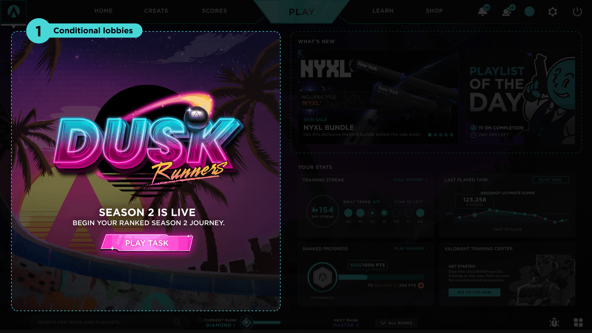
Conditional lobby takeovers pair sponsored real estate with user guidance
Aimlabs lacked a structured guide, and with so much to do, it could be hard for users to know everything Aimlabs had to offer. To address this, we added utility to our lobby takeovers.
A themed prompt with an actionable item will be displayed based on the user's progress. Whether it's creating a custom task or customizing a weapon, new users can explore features they have yet to try.
Additionally, this prime real estate continues to be a ideal for sponsors to collaborate on themed events, or for us to showcase our latest ranked season.

Get updated with news and stay engaged with Playlist of the Day
The carousel was visually updated and enlarged to better showcase new shop items and events.
We also added "Playlist of the Day", a new feature added to introduce users to our currency with daily free rewards. This also guided users through selected content and encouraged daily engagement.

A snapshot of your play history and personality in one card
The mini-profile was reworked, turning it from a text-heavy card, into a personalized card that lets users share their personality with avatars, banners, and titles. Replays are highlighted to give users a peek at other user's in-game setups and cosmetics.
BONUS
Additional improvements over time improved the user experience and updated our legacy designs.
Shop is reworked to increase engagement, improve UX, and update visual design
Horizontal scrolling wasn’t an ideal UX pattern, so we eliminated it along with the tag system. Instead, we introduced a daily refreshing store to improve engagement, featuring a new item each day and a special item that stays for a set time (for sponsors, events, etc.). This approach encourages users to return regularly to check for new items.

Before

After
Pause menu gets a visual design update & adds playlist functionality
The pause menu was updated to remove legacy branding and outdated material. It also became more functional by including a playlist widget that allowed users to switch between tasks within a playlist.

Before

After
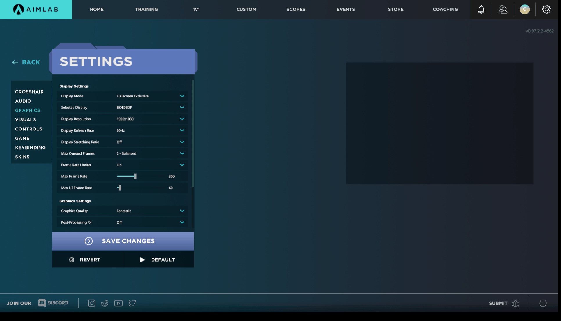
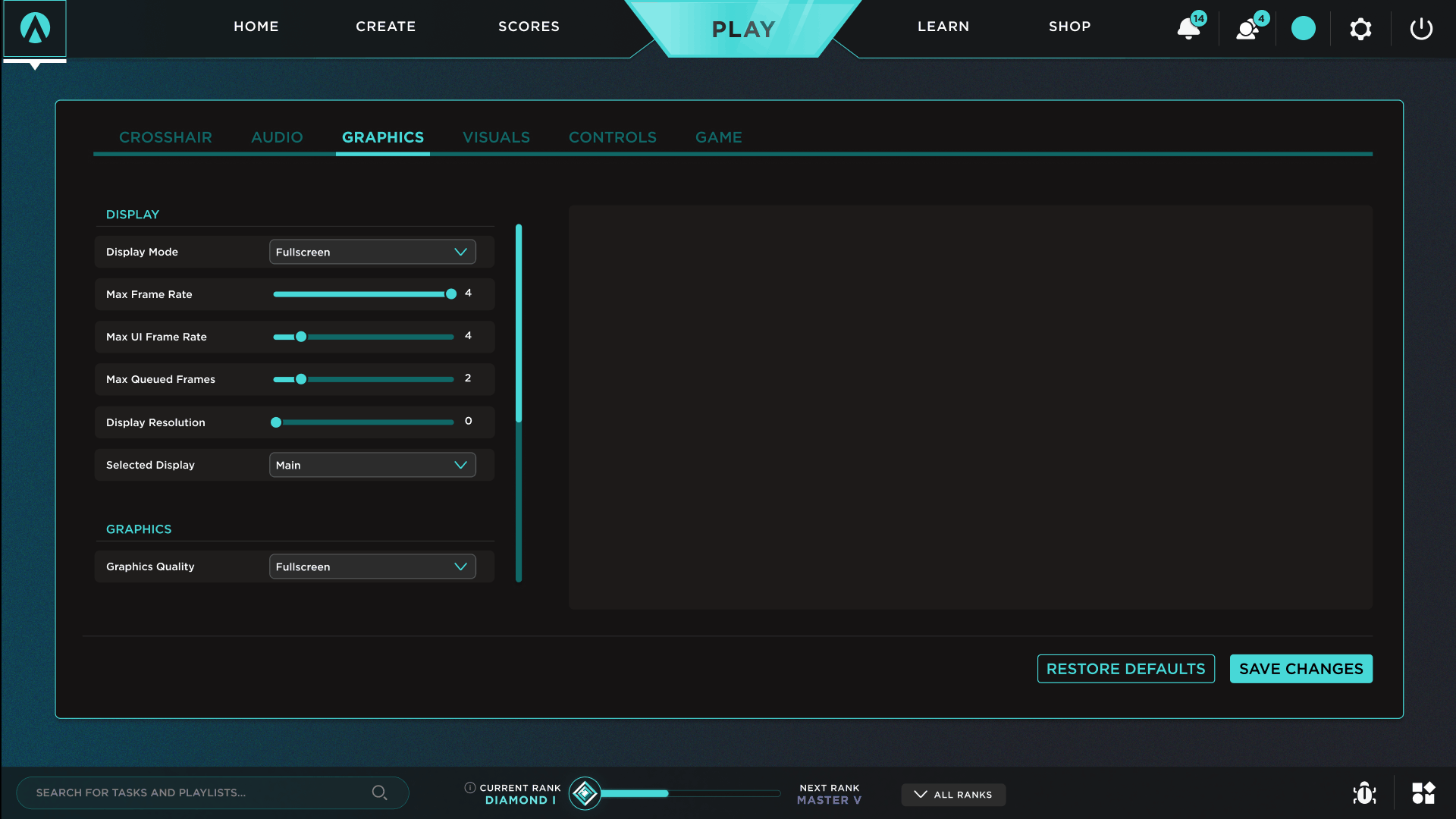
Settings menu gets a new look, with modular UI components and clearer UX
Our settings menu needed an overhaul. Many options didn't work, the settings preview area was unclear, and UI elements of different styles and sizes were patched together to squeeze additional content into a small box. Saving settings booted users back to the main menu with outdated branding.
This rework uses the entire screen and can be accessed as a popup from other locations. It's now modular for easier updates, and saving changes keeps users on the settings page, with toast notifications confirming updates to the user.
Before
After
After these projects were launched:
Reduced user churn. Many users stayed and even returned to give us another try, with users overall thankful for the changes we made with the UI.
An updated look and feel for our identity. Aimlabs got a fresh coat of paint, and with our newly established design library, we were better able to maintain this visual update.
Better UX practices moving forward. Advocating for these improvements allowed buy-in to continue making these improvements, fostering better UX practices in future projects.

Served as foundation for future projects. The nav bar, play menu, and lobby changes allowed us to iterate in future projects, allowing us a place to add new features and content in these areas.