Retirement Investment Tool

Role
Product designer
Timeline
1 week, October 2024
Overview
As part of a senior UI/UX design challenge, I was tasked with designing a solution for a client, BAM, that supports soon-to-be-retirees to create a personalized retirement plan with a focus on investment through a managed portfolio.
This desktop solution provides clients a simple way to track their finances, adjust plans in real time, and feel empowered to make informed decisions.
For MVP, I prioritized three main features, including a dashboard, plan builder, and scenario analysis feature. At the forefront of my design was making complex data and financial jargon accessible.
Clients nearing retirement face uncertainty about financial plans.
As clients near retirement, they shift from saving to drawing on those savings, which can create uncertainty when developing a personalized retirement plan.
Clients often worry about having enough savings, how to allocate them effectively, and may feel overwhelmed by complex digital processes without sufficient guidance.
Create a managed investing tool that offers a user-friendly dashboard and a personalized plan.
General Domain Questions
I started by researching some general questions to get myself in the right mindset to ensure I could understand the issue and users. These were some of the questions I sought more info on:
1. What is the difference between an RRSP and a RRIF?
2. What do people invest in within their RRSPs and RRIFs?
3. What current tools and services exist to help people make retirement decisions?
4. What are the common pain points for users when managing their retirement accounts digitally?
5. What are the best practices for simplifying complex financial information in a digital product?
Market Analysis

Next, I looked at existing tools and products to help people plan and manage their retirement. A few things I noticed:
Banks favor in-person planning.
Banks tend to push in-person financial advisors (book appointments or calls) and quick tools over a digital planning experience.
Blues and greens are prevalent colors.
This could be because according to color psychology, they signify security and trust.

Lack of user-guidance through the process.
Users were often thrown into the experience, with little to none explanation on terms, graphs, or processes. This could lead to overwhelm for first-time users of this type of product.
Lack of accessibility.
Ranging from complex language and visuals to colors and typography that doesn't meet common accessibility standards, and with no tools to help alleviate these issues.
Key User Insights
To ensure this product met user needs, I researched to understand who our users were, and what they would want from our product. These are some of my findings and conclusions.
Audience.
Focused on clients 55-71 (avg retirement age is 65, earliest to convert to a RRIF is 55, latest is 71), who want a more guidance-focused approach to planning retirement.
Fintech Literacy vs. Confidence Gap.
There is an overall need for guidance-focused features & education to help people avoid adverse decisions regardless of confidence levels. Less than 47% of Canadians are financially knowledgable, with actual understanding possibly lower.
Despite a high percentage of seniors using tech (phones, laptops, tablets), less than 30% use it for financial needs.
Need for trust and humanization.
Canadians 65+ are more likely to seek financial advice from financial advisors, bank tellers, and family members. Digital connectedness often works against this age group's desire for social connection.
Accessibility needs.
Age-related challenges such as:
-
Cognitive limitations: Need for simplified language, clear instructions
-
Visual impairments: impact of small text sizes, low contrast, and complex graphics on usability
Distilling research into 2 contrasting personas
I distilled my research to develop two contrasting personas to guide the project. Mary, who is less comfortable with technology, financial literacy, and risk, and David, who is more tech-savvy and financially confident. This would help ensure the product remained simple, while allowing for some more advanced options.


Process overview
A quick overview of the design steps I took to get to the final solution.

Thumbnail sketches
Wireframes
High Fidelity
Alternate explorations
Before arriving at the final solutions, I had a few different iterations that I decided to change or omit.


I initially had the "adjust plan" button as a central part of the mock, that would open up a popup to adjust the plan. I realized this would mean users would be making adjustments in a vacuum, without seeing the changes reflected right away. This felt more like a permanent change, rather than allowing the user to compare and contrast on the fly. I decided to focus on the compare and contrast model after this.

I explored allowing the user to save different plans, enabling them to test and save various scenarios. While it was a nice idea, it was unfortunately out of scope for this project and deadline, which was meant to serve as a quick tool. I could see it being useful for some types of users.
I created a barebones visual identity and component library for this project
Because the target demographic would have higher rates of accessibility needs, I prioritized colors and text sizes in this design system that would meet their needs. I ensured I followed WCAG guidelines with colors, contrast, typography, and language meeting AA standards, with the majority following AAA standards.
I chose blue and green as the main colors to fit well in the market, and represent security and trust.

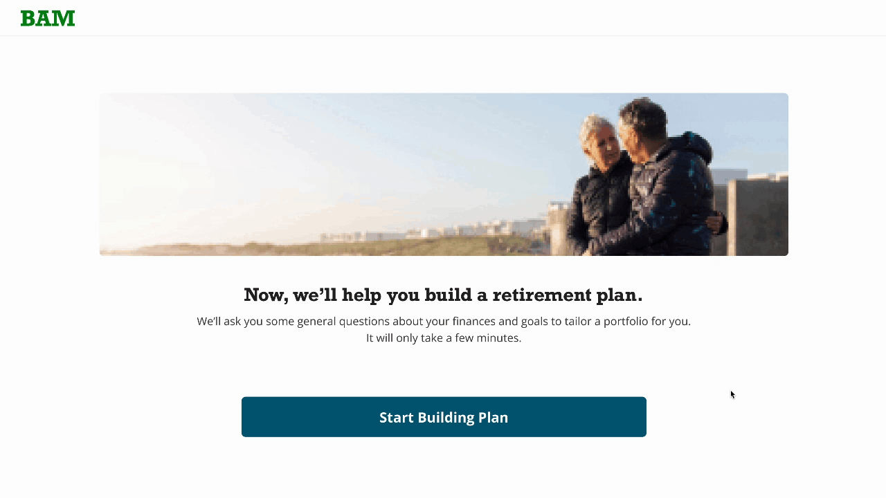
Step 1:
Complete a short questionnaire for a customized portfolio
I designed this flow under the assumption that users have already set up an account and provided basic details, such as account linking and personal information.
Next, users respond to questions about their retirement goals and financial profile. Using this input, a managed portfolio is automatically tailored to their preferences and risk tolerance.
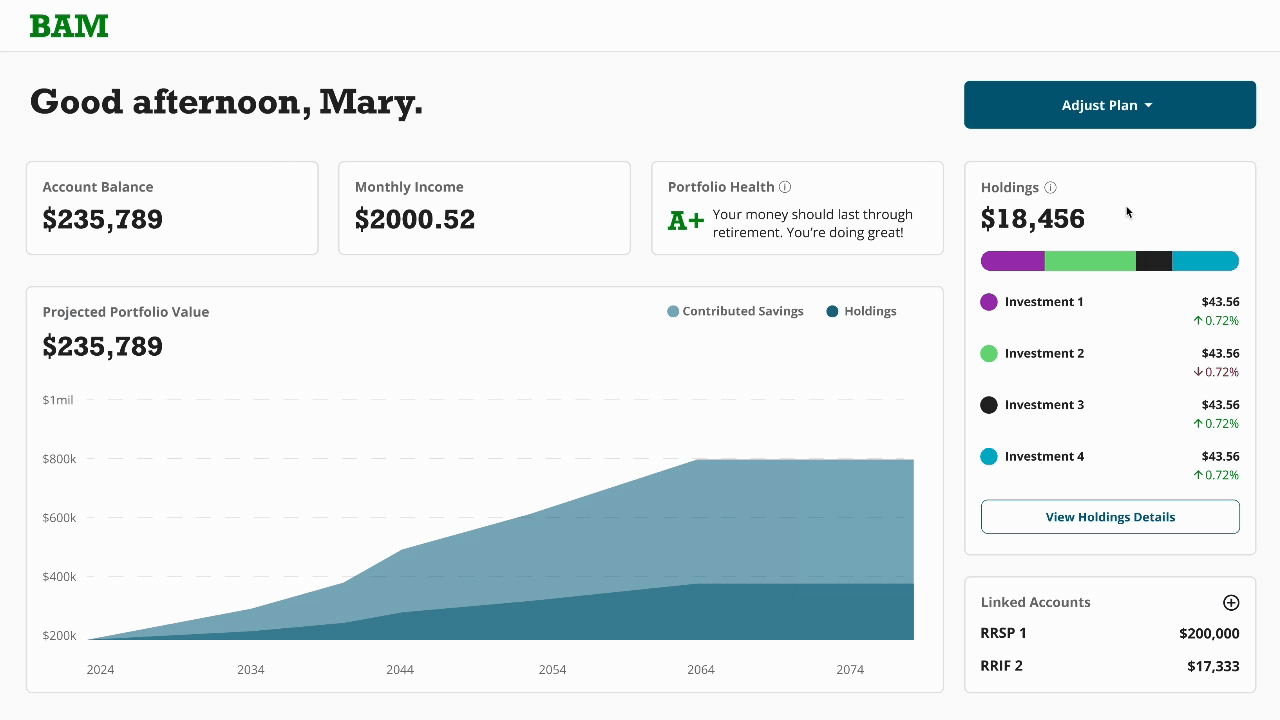
Step 2:
Dashboard of retirement investments and progress
The portfolio consists of the user’s own contributions and holdings, which are automatically invested according to their portfolio type (e.g., conservative or high-risk).
Hovering over sections of the dashboard provides additional information to provide context, such as specific financial amounts, explanations of key terms, and indicators of portfolio health.

Step 3:
Compare variables to see portfolio & plan impact live
Users can explore the dropdown menu to adjust their plan variables, like shifting to a higher-risk portfolio or modifying their target retirement age. These changes offer insights into how different decisions may impact their retirement goals.
The changes are reflected live, so they can explore freely without feeling like it is a permanent decision.